Facebook want to make the use of their advertising platform as simple as possible. And over the years it has become a lot more user friendly. They’ve loaded it with help dialogues, pop ups and creation flows to simpify what can be a complex procedure.
But there are still times when you need to ignore their “advice” and “helpful” hints to ensure the best for your adverts and the people that’ll see them.
Automatic advert placements
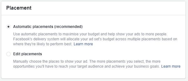
One such instance is when Facebook recommend you let their algorithm pick the best places for your adverts. Here’s what it looks like in the Ad Set options.
Zuck’s crew are clearly keen for you to let the machine do the magic and “help show your ads to more people… where they’re likely to perform best.”
Sounds good right? Not always.
The problem with automatic ad placements
With over 12 different options it can be tough to know which one might be best for your ads, so letting the algorithm pick is an alluring thought. But ever since Instagram was brought in to the platform, it messed the whole thing up.
Instagram placements look different to Facebook, so when you’ve got creative designed to look beautiful in the Newsfeed, chances are they’re going to look like a steaming poop emoji on Insta.
Steps to make it better
To their credit Facebook are now making big strides to help standardise placements in the apps’ two feeds.
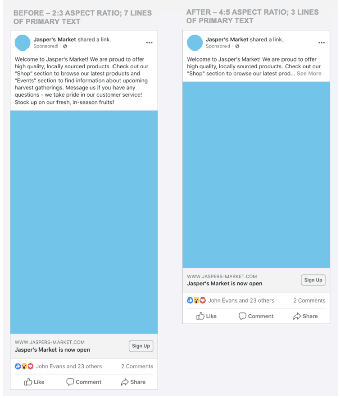
Just last month it was announced that adverts will need to use either 1:1 ratio or 4:5 ratio images with no more than 3 lines of copy so they look good on Facebook and Instagram.
Which is fine, but still doesn’t fix a little thing called Stories.
Stories will make your ads suck
You see, Stories are changing the way people use social. They’re a full screen, vertical and immersive format which requires creative to match. And that means 9:16 ratio content.
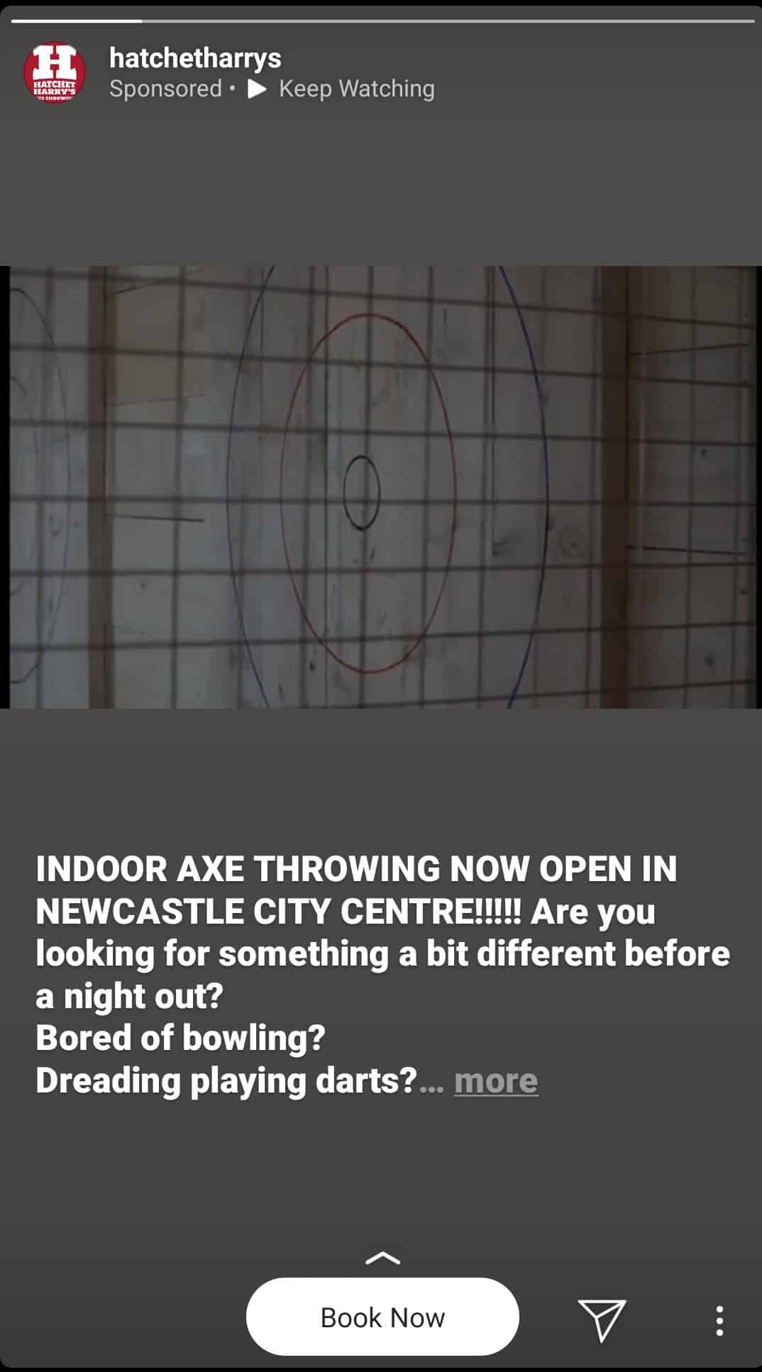
So if you’re promoting a post that looks fine on Facebook and choose automatic placements this can happen:
The video? Not full screen and just tiny.
The text? Cut off.
The experience for the user? Tap right and skip.
The post problem
Stories is also a format that doesn’t have the same interactive functions as Facebook or main feed Instagram.
So if you’re running a post promotion campaign for something like this:
It won’t work on Stories:
Because there’s no like button or public tagging when it comes to Stories.
It’s a wasted placement and wasted spend. Sure you might get more reach with your ads, but when the user can’t do the one thing you want them to do, what’s the point?
The solution to the problem
The solution to this automatic placement problem is quite simple really.
Don’t use it.
Unless you’re absolutely sure your creative and calls to action work across all placement options, you need to be selective where you adverts go. Even more so when it comes to Stories placements.
So do a little extra work, optimise for each placement, or pay someone else to do it for you.
Like me ?


