Have you got the new Facebook Timeline yet? It’s currently being rolled out over the world after being tested in New Zealand towards the end of last year. Unlike previous changes to Facebook Timeline this has been quite a subtle change, more a style evolution than brute force upgrade. This also probably explains the lack of “WTF OMG BRING BACK OULD FASEBUCK TYMELINE” pages on the social network too.
The changes to Facebook Timeline have been subtle…probably explains the lack of “WTF OMG BRING BACK OULD FASEBUCK TYMELINE” pages on the social network
If you’ve not had your profile updated or seen some shots of the new Facebook Timeline yet, let me take you on a quick tour of the design and features heading your way.
The Top of the New Facebook Timeline
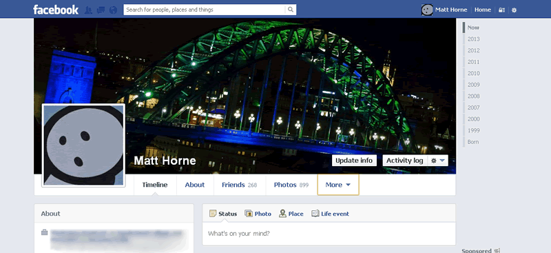
As I said before, the changes to the new Facebook Timeline are not major. The main things you’ll notice are the lack of images under the cover image. You now get text links to key profile features, and all your apps are stashed in a “more” dropdown menu.
The status update box is more minimalistic too, removing all buttons until you’ve click in to share your next witty life statement or cat photo.
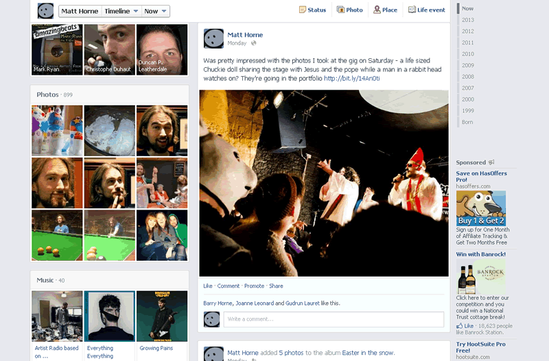
The new Facebook Timeline has also dropped to a two column layout with status updates and profile posts in the large right column and information and apps in the left side column. This means a hell of a lot more digital real estate for pictures and videos – something Facebook are really pushing as the best things to post.
Music
One of the launch partners for Facebook Timeline was Spotify. They had their own app integration ready to go so you could tell everyone what your new jam was in real time. The idea being your friends could then also have a listen and comment on how cool your music tastes were – the digital equivalent of sitting on the bus and letting your mate have one of your earphones for your Walkman.
The digital equivalent of sitting on the bus and letting your mate have one of your earphones for your Walkman.
With the new Facebook Timeline they’ve integrated music further. There’s a section on your right hand column showing off your top listened tracks and when people dig deeper they can find out even more about your music tastes.
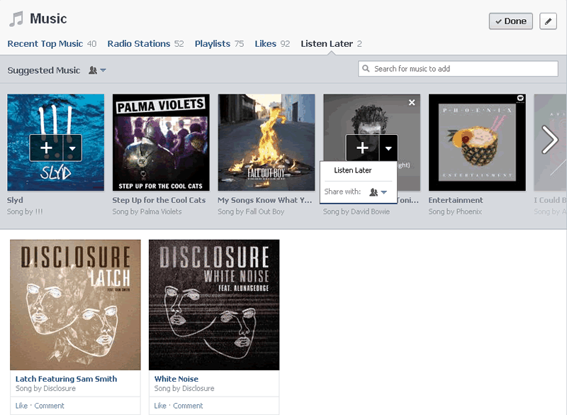
Your friends (and public if you allow access) can now see a full log of everything you’ve been up to on Spotify (and other services like Mixcloud). You also get an option to add tracks you want to listen to later in your life, settting individual privacy options for each one of these.
You can also add tracks to your listen later list straight from the front page news feed. So when you see your friend is pumping the latest dubstep banger you can whack that bad boy right in to your own profile for later enjoyment. Unfortunately there’s not a link through to Spotify at the moment which creates a playlist of your “listen to later” tracks but no doubt that’s something that will be coming soon.
New Facebook Timeline for pages
These features of the new Facebook Timeline are currently only being rolled out to personal pages on the network. Brand pages are still rocking the original timeline layout. It’s only a matter of time though till they get updated and this will bring a range of new challenges for social media marketing on Facebook.
It’s not clear yet if all the changes will be moved over, or if any at all. But if you’re in to future gazing you might want to check out my post on what the Facebook Timeline means to pages and social media marketers.


