Facebook launched their “Pages” feature back in 2009 and, like user profiles, they’ve been tinkering with the design and layout ever since. In these early days, sites like Facebook were all about desktop users, giving loads of space for content on big screens.
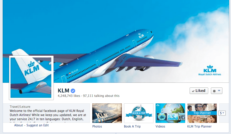
Desktop Facebook Pages provided loads of real estate for branding, starting with the profile image, then additional app thumbnails and by 2012, the huge page cover image.
Creative brands took advantage of this, using the space to make fans say “Wow aren’t these guys creative, I want to buy more shit from them because they’ve been clever.”
It wasn’t long though till, like any space on the internet that people might look at, brands soon realised the huge cover image could be used as a billboard to hawk what ever they wanted to plug to their “fans”.
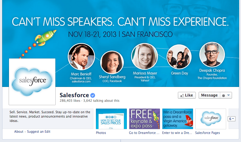
Which was all well and good, until Facebook focused on mobile, and moved the design goal posts.
Although the recommended cover image dimensions have stayed at 851px x 315px, the way cover images now display on the range of mobile devices is completely different.
In their guidance, Facebook recommend you use a bold image that best represents your brand, and they famously hate text overlays on images.
However, as you’re about to see. Even some of the biggest brands are still failing to adapt to the mobile first world of web design.
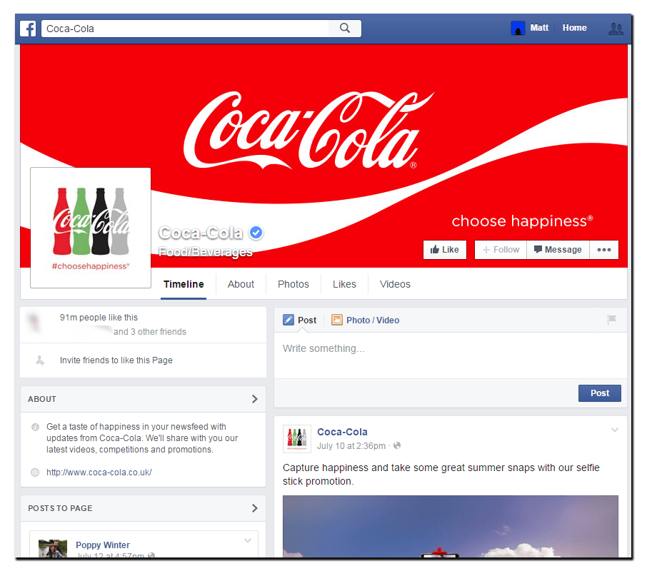
Coca-Cola
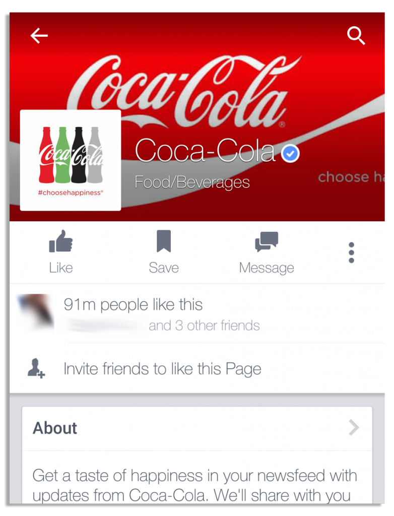
Frequently cited as the number one brand on Facebook, with more fans than any other company. Social Media blogs bloody love them, and so do soon to be obese kids.
From this screen shot you can see, they’re keeping it real with the 20% rule and asking you to “choose happiness”. Looks pretty good right?
But when you look at the Coca-Cola’s Facebook page on a mobile device, the message suddenly changes to a much more sinister tone.
It would seem for mobile users, Coke’s message is to jump on the H-train. Must be a new recipe they’re trying after ditching cocaine from their original.
[bctt tweet=”For #Facebook’s mobile users, @cocacola’s message is to jump on the H-train.”]
Pepsi
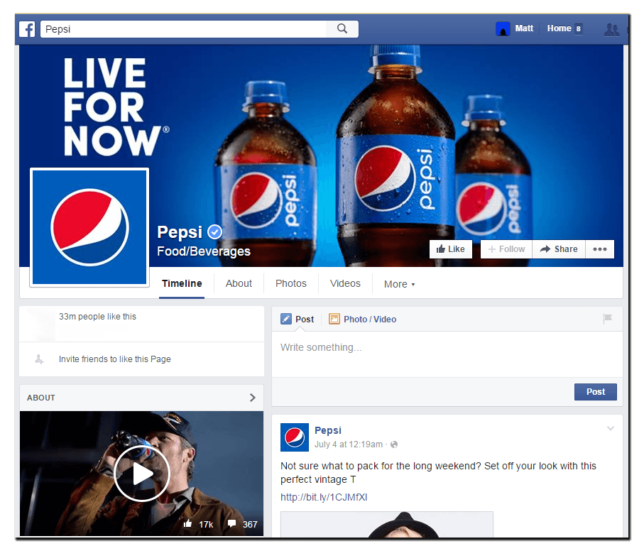
Always one for fairness, I thought it would be nice to see if Pepsi are any better than their main rivals Coke. As you can see, on desktop Facebook they’ve got a lovely looking cover image.
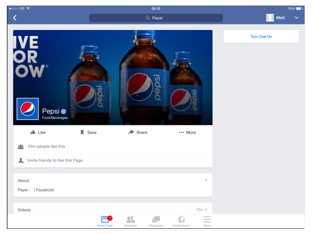
But when you look at Pepsi’s page on an iPad the message makes a little less sense.
It looks like Pepsi have a new game for iPad users to play, “Ive or ow”.
McDonald’s
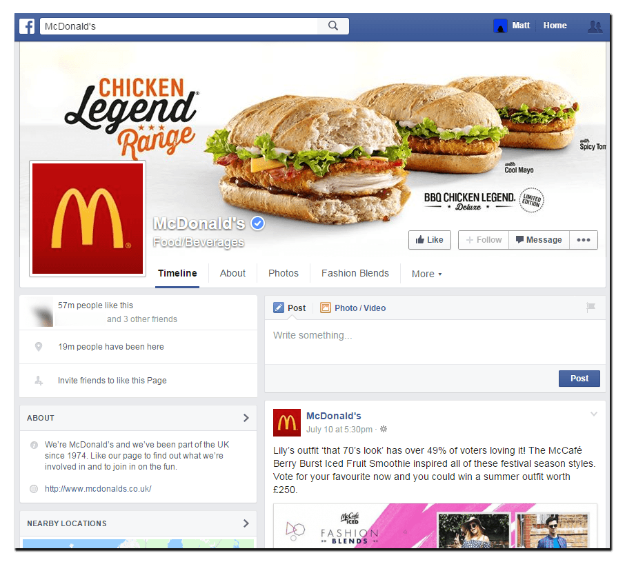
Sticking with healthy things, lets look at what kind of message McDonald’s Facebook page cover image is giving. On a desktop, it’s all about their mouth watering Chicken Legend range.
Seems fairly standard, push the product and get them people salivating for more. Add in the limited edition to give this fast food a sense of urgency too.
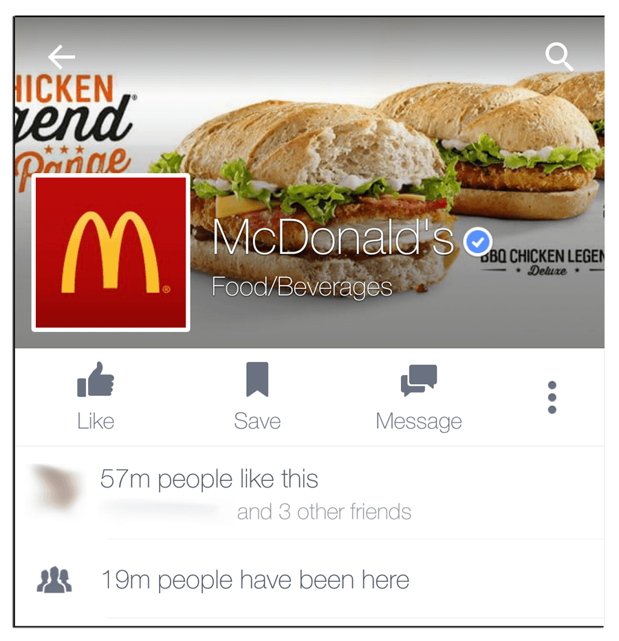
Sadly, it doesn’t quite come across the same on a mobile device.
If you’re browsing Facebook for fast food on your phone, you’re in for the treat of a life time with some delicious “icken end”. Don’t you just want to chow down on some ends right now?
[bctt tweet=”If you’re using the mobile #facebook app @mcdonalds have some delicious ‘icken end’ to sell you”]
Amazon
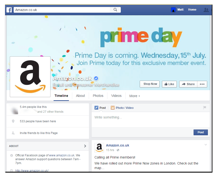
Moving from fast food and in to the tech world now. Amazon are huge on the internet. Not only are they biggest commerce site online, they also own the web platform that runs some of the world’s major company websites.
With this in mind, you think they’d understand all about the difference between view port sizes. But from what you’ve seen already, you can kind of tell this advert image isn’t going to translate well on mobile.
Soooo much text on the image, this is not going to look good on other devices.
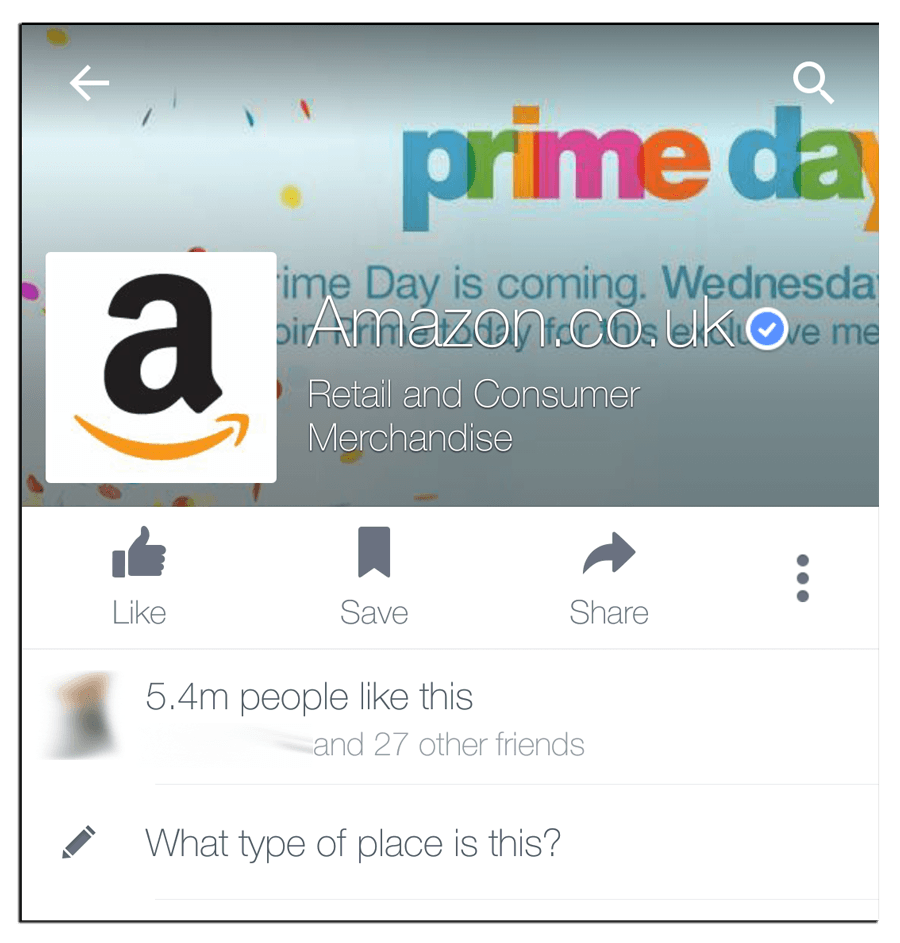
Text on text with some more text for your visual pleasure. Not only that but Amazon now seem to be letting us in on the activities of Ime Day, who I’m sure wouldn’t want you to know what she’s about to do.
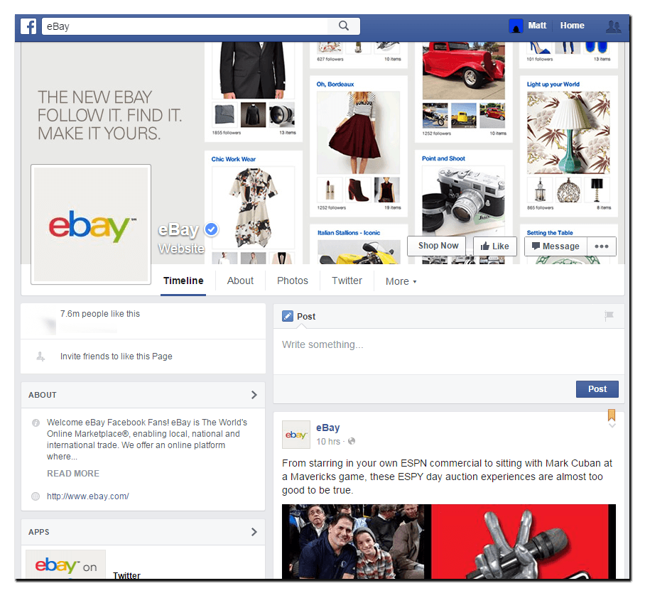
eBay
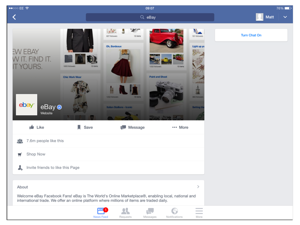
Keeping in the shopping domain, auction site eBay does a lot of work with their Facebook page. As you can see from the desktop site they’ve got a catchy tag line too.
Sadly that doesn’t really translate to mobile very well.
With the text cut off we’re left with a rubbish Haiku and terrible grammar. Slow handclap please for eBay.
[bctt tweet=”On @ebay’s mobile #facebook page you’ll find a rubbish Haiku and bad grammar”]
How to avoid this
With big brands making this massive error in Facebook design, you might think it’s something that’s hard to avoid. But in reality it really isn’t.
To avoid giving your fans a bad experience on mobile, just get rid of your text overlays. As with anything on Facebook, if you’re not paying for it, they’re going to make it as difficult as possible for you to use it as an advert.
With all the design tweaks Facebook makes, the only thing that’s consistent is the fact that your text overlays won’t look great on every device.
[bctt tweet=”On #Facebook, if you’re not paying for it, they’re going to make it difficult to use it as an advert.”]
Stick with a nice big image of something relevant to your brand, and make sure the focus of the image is in the centre as that’s the only thing that is clear on all devices.
Not sure if you’re doing Facebook right? Get in touch and see how I can help you make the most of the world’s biggest social network.
Seen some other terrible Facebook cover images? Let me know in the comments below.

