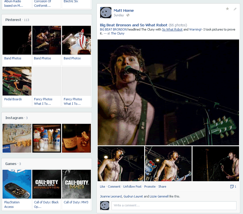
Facebook have yet to roll out the new Facebook Timeline for pages which means social media marketing people have a bit of time before having to change their strategies again. But based on past experiences, it won’t be long until Facebook push the new timeline out across the whole network.
When it comes to pages and marketing on Facebook, this will present a few new challenges for social media marketing which you’ll need to consider.
Space increase for posts
Your marketing images and videos will take pride of place on your page. Great if your brand is suited for this kind of digital content and you have the resources to create it – not so great if your current digital strategy is heavily based on words.
Maybe you should think about using a services like Quozio to make striking images using your words instead. Or better yet, get in touch and ask to use my digital content creation skills.
The loss of app buttons
The main issue for the new Facebook Timeline for pages is the lack of app buttons under the cover image. When Facebook first introduced these they were a great way to promote landing pages and features of your Facebook page. If they go the way of the personal profile these will now become hidden in the “more” drop down menu meaning first time browsers will not find them easily.
Maybe they will be placed within the left hand column similar to the way music, fitness and movies apps on a personal profile? This would be great as it gives them a highly visible presence on your page. However, you may need to start thinking about the design implications if these are snap shots of your app.
Highlighting and pinning posts
With all posts going in to the right hand column, will this mean Facebook remove the ability to highlight and pin your important posts? These are handy promotional features for key posts on your Facebook page – similar to sticky blog posts. If these go, a new way to maintain key post prominence will be needed. Possibly a sticky app in the left hand column?
The highlighted post feature won’t really be required though since images and videos will now automatically get a huge amount of space on your page’s timeline.
Image dimensions
As with every Facebook update, there’s no doubt the default image dimensions will change. That means all your page’s nicely framed photo posts and image designs will need to be re-done.

At first glance things like cover image and ad dimensions have not changed which is good. However, it’s worth noting your single image posts will now default to landscape rather than the current portrait style.
What next
We sit and wait. These are just a few initial thoughts from what I know about the new Facebook timeline on my personal profile. Only Mark and his BFFs know exactly what the new timeline means for Facebook pages and I’m sure they’ll let us know eventually. Until then, we can just speculate and anticipate.
What do you think the new Facebook Timeline will mean for pages? Have your say in the comment box below.

Comments are closed.